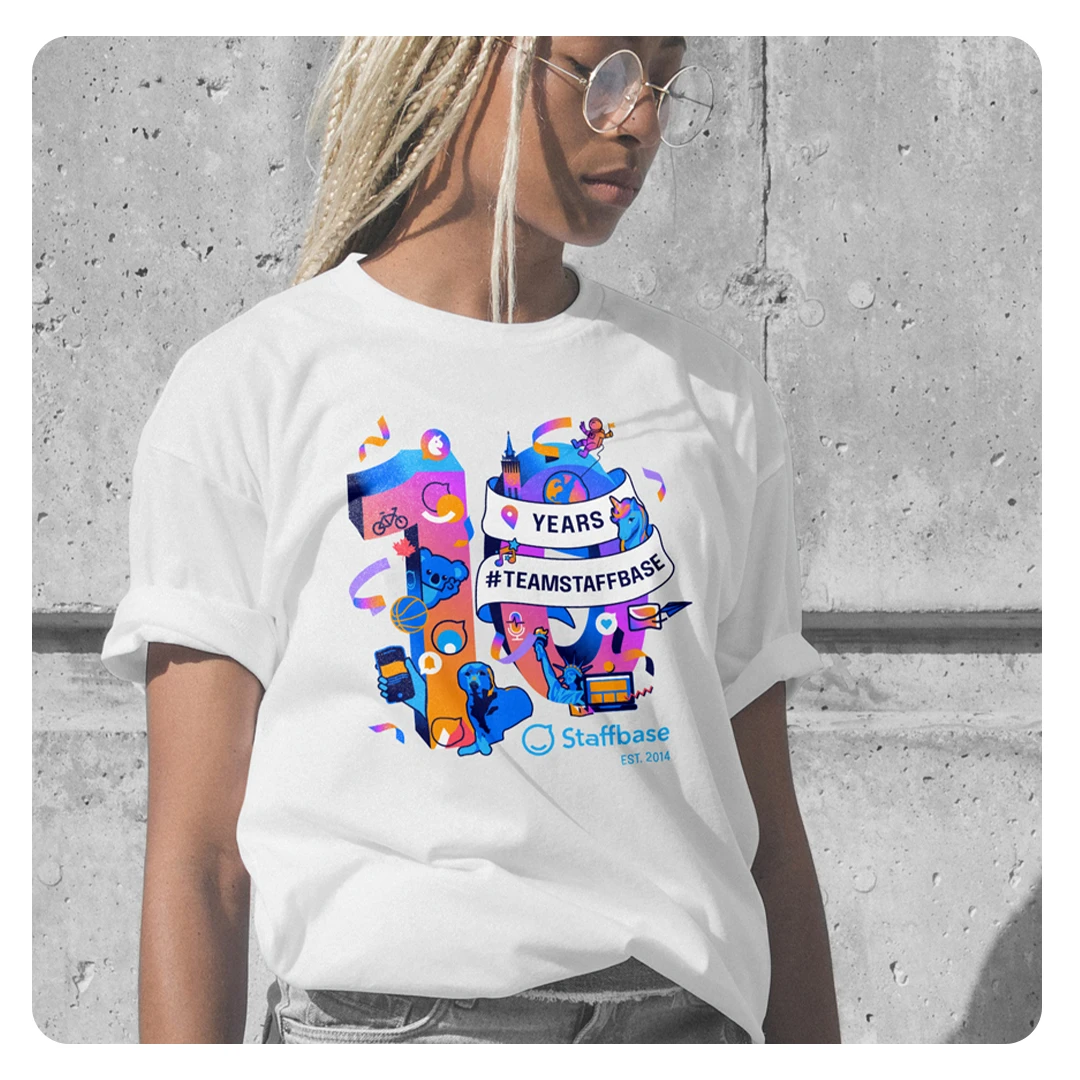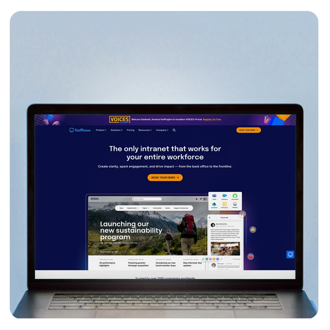
The previous brand identity was energetic and playful—but as the company matured, it no longer fit. Visually, the brand had become cluttered: too many elements competing for attention, making it hard for key messages to land. More importantly, it lacked the clarity and professionalism needed to resonate with our evolving, enterprise-focused audience.
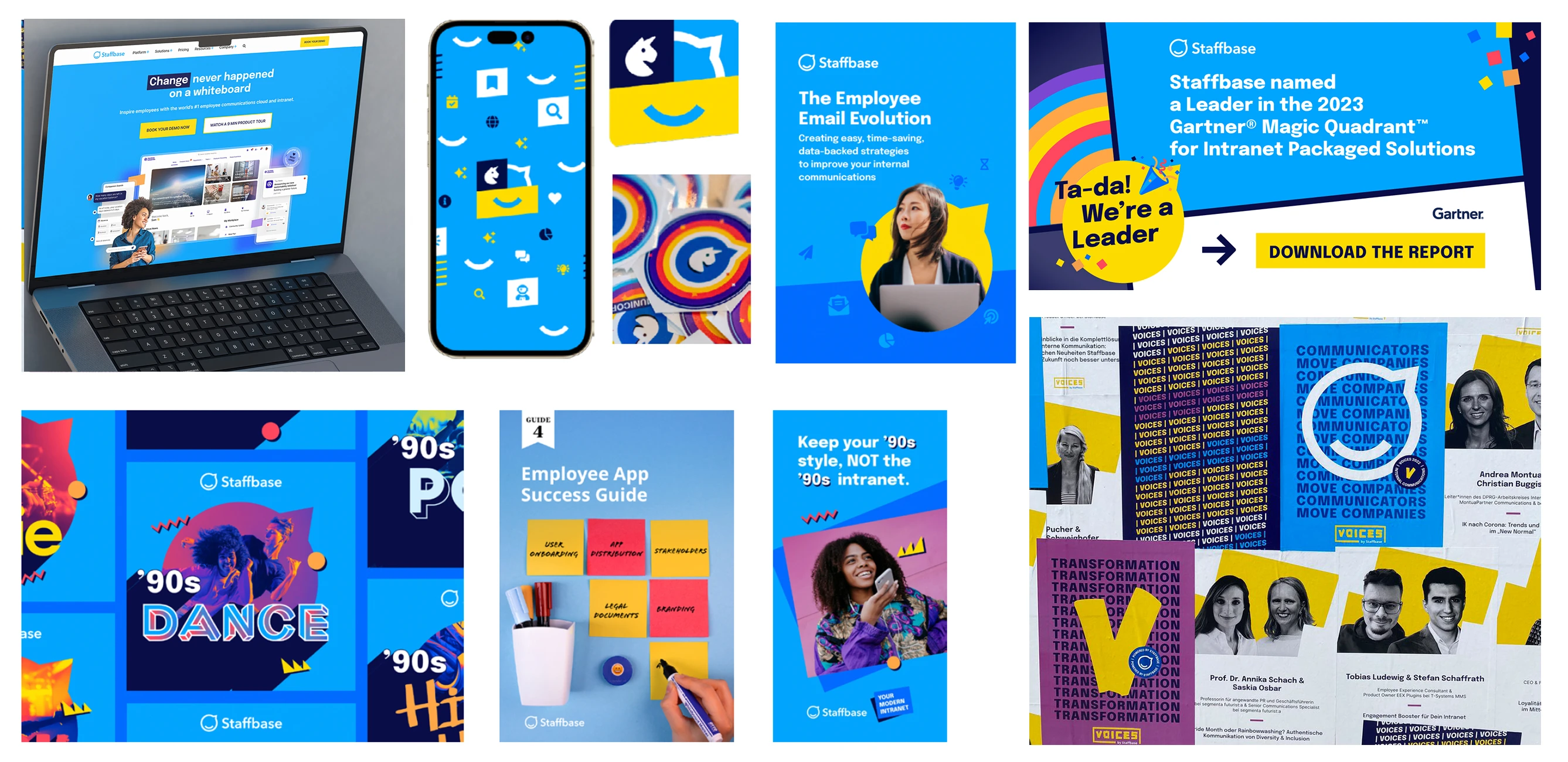
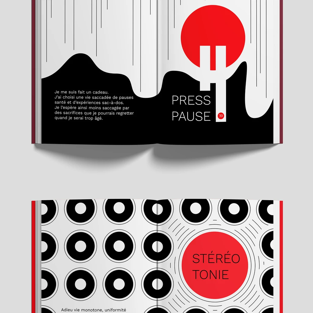
We set out to refine—not erase—what made the brand unique. The challenge was to mature the identity without losing its personality. We adopted a content-first approach, stripped back visual noise, and introduced a cleaner, more structured design system. This included a refreshed color palette, streamlined typography, and flexible layout principles that gave content room to breathe.
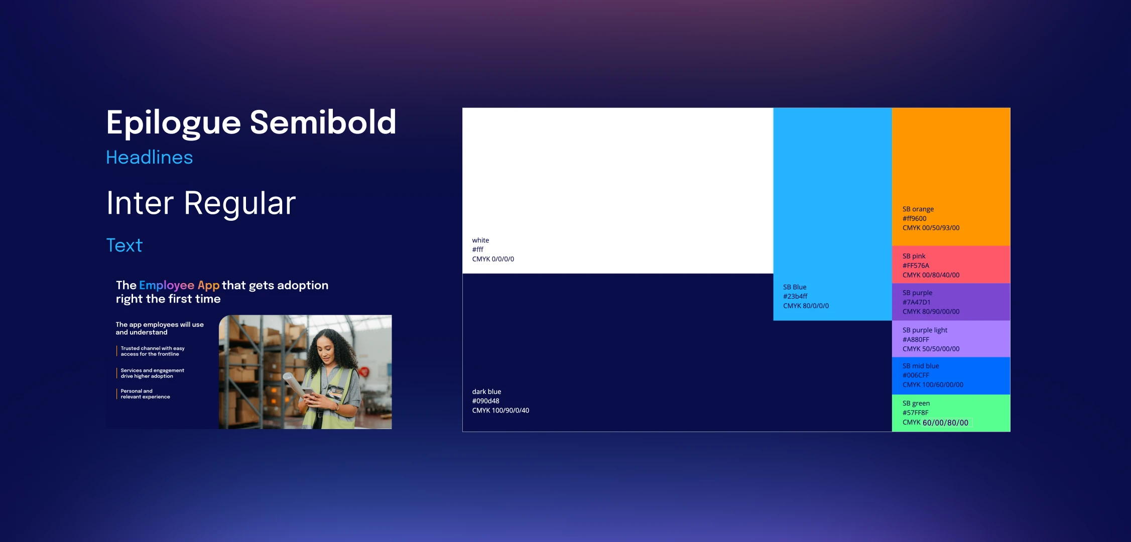
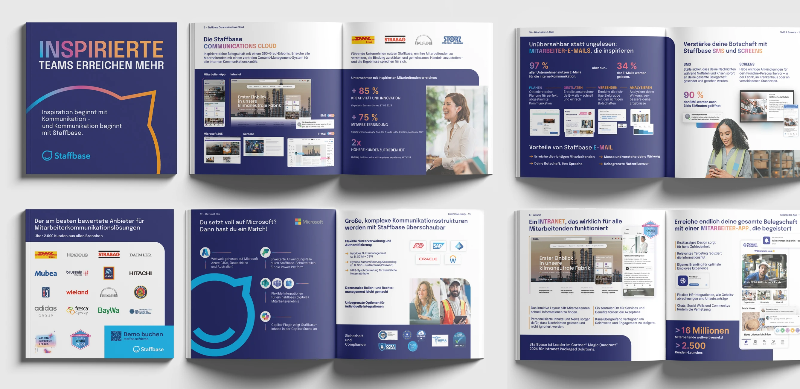
The new brand identity is both functional and expressive. Designers now work faster and with more confidence, thanks to a well-documented system that encourages thoughtful variation. Internally, the rebrand was embraced across departments—not just for its aesthetics, but for how well it reflects where the company is today.